Well, another late submission on the how-to's.
-
Magic, as it has been called.
-
I was bored and wanted to just play around with ideas and concepts. Man, I have to play more and update this more often.
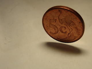
Here is the already quite impressive original image, but it looks boring...
The trick to having this one seem like it’s caught in mid-fall is due to balancing the coin on its side… on a sheet of glass. Now you’re probably wondering why there is no reflection off the glass, right? Well, it’s because I have the flash firing from slightly above and behind my “subject” reducing light glare. The sheet of glass was placed on top of an old sheet of white card-board (thus the reason for the ‘cracks’) and to reflect some light back up from the flash.
~0~
 I took the image into my trusty Photoshop and got to playing with ideas. I didn’t know at the time of capture what I wanted to do with it but I soon got some ideas.
I duplicated the layer 4 times and then got to work on each individual layer.
I took the image into my trusty Photoshop and got to playing with ideas. I didn’t know at the time of capture what I wanted to do with it but I soon got some ideas.
I duplicated the layer 4 times and then got to work on each individual layer. Okay, I’m going to assume you know how to navigate your way around Photoshop…
~0~
Layer 1: I boosted colour with selective colour and then a pinch of contrast, finally adjusting levels to make it a little lighter, to get the desired, rich colour toned, effect.
~0~
Layer 2: Converted to black and white (I did this by reducing saturation to zero, though there are other methods of doing this too) and adjusting brightness/contrast and levels somewhat so the coin itself had a nice silvery look to it. Okay, from here I made use of my eraser brush to erase everything around the coin. Initially I wanted the coin B&W on a coloured backdrop but when I erased a little too much I got another cool idea. So, I made the size of my brush much smaller (using the (Windows) square brackets [/] short-cut) and set the opacity to around 30% to create a nice faded effect (different opacities can be used too) and gradually erased parts of the coin, like the bird and the 5c until I’d achieved my desired effect. So now I’ve got a coin that looks well used but faded on the inside of the elevations of the coin as opposed to the outsides being faded.
~0~
Layer 3: Another colour version, selective colour to make the white slightly more yellowed (as I did on the first layer) and then just levels increase, more contrast to darken the background and that’s it. So now all that will be removed from this one is the coin and some of the shadow. I used my magnetic lasso tool to cut out the coin and then with my eraser, still set to 30%, I began to fade away around the edges of the coin and followed onto the shadow for effect. Remember, not too much otherwise you’re going to sit with a mess and not a decent blend. Also, adjust the size of your brush according to how much you want to erase.
~0~
Layer 4: Yet another black and white conversion and even more contrast to really darken it and enhance the cracks even more. I adjusted levels as well to darken the rest of the layer too. Once again, allot of erasing took place. This time I started on 50% and a reasonably big brush and erased from the coin outwards in a circular motion. I then adjusted the eraser to 25% and continued to erase away from the coin until I had a nice, rich blend between the colour and B&W layers. Last thing to do was to click ‘File’ and ‘Save As’ and saved it to get what you see below... an image that has folks saying things like "wow" and "it looks like magic" to name but a few.
A bit of work but if you’re after a nice artistic look and feel, it’s well worth it.
So ends another in the series of artistic editing.

---o0o---


Heya Collin, there are so many great ideas at work on this relatively small section of the WWW. You have indeed got a pretty good eye for unconventional photography and a sound knowledge of photoshop that is easy to follow. Thanks for posting this blog.
ReplyDelete