Okay, so you have a nice photo taken. But, it's just a photo and you want to wow viewers with a different look, right? Sure you do... I mean, why have normal photos that do look nice if you can add a little something to make them so much more.
So, below is a couple of examples of 'how to' make your images a little more striking when printed and framed.
This first crop of a Rose and buds is nice, great background, detail and so on. But, the colour is a little "flat" and the image isn't nearly as striking as can be. Time for it to go into Photoshop.

Okay, I duplicated the same layer twice over the original. Then I started on the original layer with some shadow/highlights (Image, Adjustments, shadow/highlight) and selective colour (Image, Adjustments, Selective Colour) to lift the colours and lighting a bit to make it stand out more.
Then, on the second layer, I used the Dream Suite plug-in to add a ghost blur effect. Then, on this layer I used my erase tool, set to about 250 and opacity of around 25, to gradually start erasing from the centre of the Rose bud so as to fade it towards the edges. I did this to keep the detail sharp in the centre of the rose but blur it out to the edges to create a dreamy look and feel. It did take a couple of attempts, but got the dream feel I was after. So, now it started to look good... but that was not enough to complete this Rose image, it was lacking something... oh yes, the third layer. I de-saturated (Image, Adjustments, Saturation) this layer (removed all the colour to black and white) and then added a strong contrast (Image, Adjustments, Brightness/Contrast) to darken the blacks more. So now I have a black and white layer over my other work. Again, the erase tool was called upon. This time with the opacity at just under 20 (can't remember exactly) and size of 600, I started to erase from the centre. With each click, I would widen my circumference until I had created a vignette look to mostly the corners of my image enhancing the focal area.
Final result below.

---o0o---
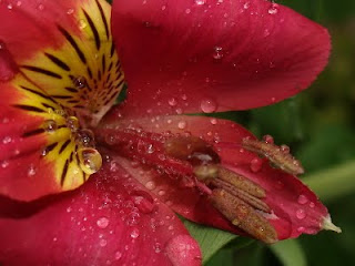
Here is another example of a similar processing style. The only difference is that instead of the vignette looking corners, I opted for a Diffused Glow blur (which basically enhances light spots and gives them their own unique hint of blur) which I then gave an opacity of 65 so it would blend more with the original image.
Note: This Inca Lilly has had NO colour enhancement, shadow/highlight work or anything, except for cropping it for composition purposes.
Before ->
After ->
 And so ends part one.
---o0o---


No comments:
Post a Comment