Apr 26, 2010

Roadsides of South Africa

~o0o~
You know, travelling a lot can get quite tedious, boring and tiring… very tiring. But, if you have camera at hand, it changes everything just that little bit. Well, for me it does...


Collin Scott, roadside images, landscape, hdr, artistic editing, photography, south Africa, Mpumalanga, Free State, Limpopo, Sony dsc-h10


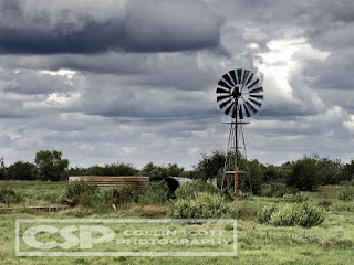
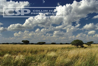
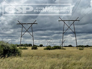
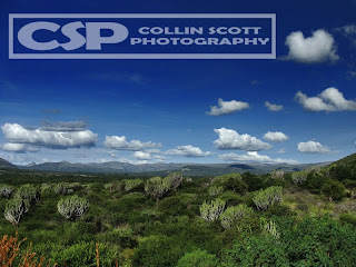
You see, I take some of the most boring roads in South Africa and seem to find beauty in them. It is finding the exceptional in the ordinary that makes the many hours in the car so worthwhile.


Collin Scott, roadside images, landscape, hdr, artistic editing, photography, south Africa, Mpumalanga, Free State, Limpopo, Sony dsc-h10Collin Scott, roadside images, landscape, hdr, artistic editing, photography, south Africa, Mpumalanga, Free State, Limpopo, Sony dsc-h10


My secret? I challenge myself, if I can put it that way. What I do is look ahead, still watching the road, but also the sun’s position, time of day, and the scenery. If I spot something up ahead, I start to plan what’s around it, where can I stop, how is the lighting etc… if It all seems okay, I’ll slow down, double check my surroundings and the safety of the stop. If all plays out, stop, hazards on, get out and walk around to find the best composition.


Collin Scott, roadside images, landscape, hdr, artistic editing, photography, south Africa, Mpumalanga, Free State, Limpopo, Sony dsc-hCollin Scott, roadside images, landscape, hdr, artistic editing, photography, south Africa, Mpumalanga, Free State, Limpopo, Sony dsc-h10


Then I take a few shots, different angles etc because I still don’t get it right the first time and one take is never enough.


Collin Scott, roadside images, landscape, hdr, artistic editing, photography, south Africa, Mpumalanga, Free State, Limpopo, Sony dsc-h10Collin Scott, roadside images, landscape, hdr, artistic editing, photography, south Africa, Mpumalanga, Free State, Limpopo, Sony dsc-h10

I have travelled quite a few roads and have impressed many people with my images.


Collin Scott, roadside images, landscape, hdr, artistic editing, photography, south Africa, Mpumalanga, Free State, Limpopo, Sony dsc-h10Collin Scott, roadside images, landscape, hdr, artistic editing, photography, south Africa, Mpumalanga, Free State, Limpopo, Sony dsc-h10


Look, sometimes, I do the quick runaround thing because I do have timelines and thus get the images either under or over exposed but usually nothing that a little Photoshop can’t uh, fix.


Collin Scott, roadside images, landscape, hdr, artistic editing, photography, south Africa, Mpumalanga, Free State, Limpopo, Sony dsc-h10Collin Scott, roadside images, landscape, hdr, artistic editing, photography, south Africa, Mpumalanga, Free State, Limpopo, Sony dsc-h10
So, next time you’re planning a short drive of more than an hour or between two cities with open countryside, look around, then look some more. Pull over, take a breather, sometimes you see things you wouldn’t usually see when you’re next to the car stretching your legs… Collin Scott, roadside images, landscape, hdr, artistic editing, photography, south Africa, Mpumalanga, Free State, Limpopo, Sony dsc-h10Collin Scott, roadside images, landscape, hdr, artistic editing, photography, south Africa, Mpumalanga, Free State, Limpopo, Sony dsc-h10

Bear in mind, these images are all shot with a compact camera.

Mar 29, 2010

HDR – An alternative process

So, HDR is the way forward for post editing images these days. It’s a great way of converting your normal image into something more… a work of art if you’d like to call it that.
What is HDR? High Dynamic Range – more can be read ->HERE<-
There are various ways of doing HDR conversion. The primary (and said to be proper) way is to take multiple images of the same scene [set at different exposures] then using software like Photomatix or Photoshop to basically merge these layers together creating a final single image that has the fullest colour range, without all the bright bits of a normal photo.
Well, I do it differently.

I use one image that I blend and alter in various layers.

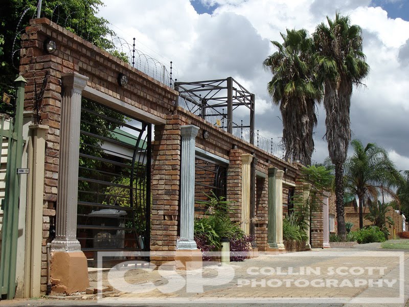
Okay, so the original, like this one below, is actually “not bad” to start with. Good light, nice colour and detail but it’s just another photograph… yawn… I started out just adjusting the colour for richness and a little more vibrancy. As usual, I got carried away and started to add more and more layers.

Collin Scott, photography, photoshop, hdr, artistic editing, sony dsc-h10, photo processing, digital photography
First port of call was to address the bright sky and darker foreground selectively, basically try to recover some of the detail in the clouds and lighten the trees and brick work. I did this in two additional layers. The first is just a light painting of black over the clouds, I set the brush opacity to around 20% and painted all the sky. It’s fine to spill over a little, that’s what the eraser is for. The second layer was to get a little light back over the foreground, darken some spots and lighten others. This is again done with black and white paint. I set this layer to soft light and painted areas like the paving and parts of the wall with black. I painted over the trees and the foreground shadows with white to lighten these up a notch or two… and then set the layer opacity to 40% (though this changes depending on image and how much I want it to reveal or blend).
Collin Scott, photography, photoshop, hdr, artistic editing, sony dsc-h10, photo processing, digital photography Woops! Now I have it looking somewhat flat! My bad… okay not really. This is deliberate, you’ll see why in a bit. I now duplicated the original image and adjusted the exposure up a tad to brighten things up again and give back some colour [opacity remains at 100%]. I set this layer to soft light as well for obvious reasons. Now it’s starting to look more like a nice image with pretty colour and detail, right? I then duplicated the original again, set it to soft light too with opacity of 12% and it made the slightest of difference but will come into play later as it merely tones the image by that 12% colour wise.

Collin Scott, photography, photoshop, hdr, artistic editing, sony dsc-h10, photo processing, digital photography Now, one of usual tricks is of course, the black & white layer (desaturation and brightness/contrast adjustments merged into layer). Soft light setting again and this time 35% opacity (yes, opacity will vary depending on how much shadow you wanting back). The problem with this layer is now the clouds become even brighter than before. No problem to my trusty eraser… be careful not to over erase though. Look! It’s really standing out now! How cool am I?

Collin Scott, photography, photoshop, hdr, artistic editing, sony dsc-h10, photo processing, digital photography

But, the sky, seriously, look at that sky!! Still too bright and clashing with the rest of the picture. New layer again and yes, you guessed it, set to soft light again (with opacity at 100). I used a heavy brush of black paint and got to painting all the light spots like the sky and all the pillars. You have to admit, it was needed, right? Okay, none of this is really needed, but I love doing it, so I will do it.

Collin Scott, photography, photoshop, hdr, artistic editing, sony dsc-h10, photo processing, digital photography

Looking good? Almost… I’m still not happy with those bright clouds. So, another [soft light] layer is added and more heavy paint work is done. This time, just to the clouds because the pillars look good to me. This has now gotten the colours and detail of the clouds to match the rest of the image quite nicely I think.

Collin Scott, photography, photoshop, hdr, artistic editing, sony dsc-h10, photo processing, digital photography But, all this work comes at a price of course… in this case, it was light, the image is now a lot darker than when I started out on this project. So I played just a little more adjusting levels and then of course playing with the selective colour feature… as always… what can I say, I like to enhance the colours to give you this pretty little picture.

Collin Scott, photography, photoshop, hdr, artistic editing, sony dsc-h10, photo processing, digital photography

So, ladies and gentlemen, another tidbit to add to your learning curve. Remember, shoot wisely, plan carefully and always, always have fun doing it.

Oh, you can also drop me a mail on cdscott76@gmail.com if you’re keen on any prints or other queries you might have.

Feb 10, 2010

Catch of the day!

This was a bonus for me, right place, nearly right time as my camera was but mere meters away from the action that started to unfold. I was just coming back indoors when this “commotion” caught my eye. Lo and behold, in the corner of the dog box, this fly had made its way into a spider’s web. A Feather Legged Spider had set up office in this little spot and as usually just gathering dust, until this fortunate moment. When I first saw this, the spider was still trailing its way down to the ever wriggling fly. By the time I had gotten back to the scene of the crime, the fly was already in the process of getting wrapped up. Below is a series of snaps that I got of this bad boy in action as he wastes no time wrapping his meal up for take-away. I wonder if it had a family to feed as that looks quite a bit bigger than him… or is it her? Hmm… curious.
The wind had picked up and drizzle had started to fall so I think both me and the spider had to act quickly...
Unfortunately, I missed the initial paralasis stage where the spider gives the fly the insuing sting while running for my camera.
These photos were taken in quick succession of each other so you can imagine this all went down quite quickly.
Now to tuck the wings back in.
Say your prayers little one...
Final stages of the process.
You can almost see the thorax movement as it works that web at a rapid pace.
Last inspection and closing of any open gaps...
Then all that's left is to grab it and haul it up to safety.
Safely home and into storage. by this time the rain was pounding down and the wind howling so in fear of equipment safety, I retired the camera for a cup of coffee.
I can now only still imagine what Frodo must have gone through when he was in the fly's position...

Among Giants

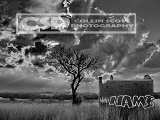
Living among us giants, faeries still do exist. But, it is the rare few that see them, or at least where and how they live in these modern times... I don't know if any live here anymore as this old house seems quite abandoned. I wonder if they had to move because of all the development that has taken place around them over the last 6 or 7 decades. Sad actually, to think that once there lived the most magical of creatures and we as human beings have forced them out of their habitats...
Okay, not really, this was just me getting creative and adding to my artistic editing. You see, the image below is the original 30 second exposure that I took a few days ago. Note the skew horizon, the very dark foreground and all round poor detail.
While I was looking at this in my photo viewer, ACDSee Pro 2, I wondered what it would look like with lifted shadows and straightened horizon, it brought an intriguing look and feel to it and I wondered about the its potential. Hmmm... PhotoShop!
Okay, so I never did very much in PhotoShop besides a pinch more lighting and a colour boost to give it a bit more life... but I felt it had a void, something was missing, it seemed interestingly boring...
So, now I got creative. First thing I did was go into my archives of photos taken, I rememberd having the perfect picture of an old house that would work, cut and trimmed it to fit. I then had the task of making sure that the old house fits the colour tone and mood of the rest of the image, so some time later, I was happy. Gave the over-all image a complete boost of colour and contrasted brightness.
Threw in another image layer, a high-contrast B&W version which I filtered down to be barely noticeable but to add some more shadow.
Once I'd gotten it to look a little more intersting I decided to give it a more interesting and mystical look... by adding another layer, but this time with a gaussian blur (set to 12.5% blur) and filtered that layer over the others. It, of course, made the foreground a bit too blurry so I erased some (with a 25% eraser) just to add some sharpness back. The end result is quite impressive if I do say so myself. Let's take a look at that one again...
Well, not being completely satisfied (and a little curious), I went forth and converted... to black and white... just to see what it would look like. Well, that's it... another installment done... hope you all liked and enjoyed... take care... take pictures... and have fun!

Jan 26, 2010

Artistic Editing 3

Well, another late submission on the how-to's.
-
Magic, as it has been called.
-
I was bored and wanted to just play around with ideas and concepts. Man, I have to play more and update this more often.
Here is the already quite impressive original image, but it looks boring...
The trick to having this one seem like it’s caught in mid-fall is due to balancing the coin on its side… on a sheet of glass. Now you’re probably wondering why there is no reflection off the glass, right? Well, it’s because I have the flash firing from slightly above and behind my “subject” reducing light glare. The sheet of glass was placed on top of an old sheet of white card-board (thus the reason for the ‘cracks’) and to reflect some light back up from the flash.
~0~
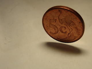
I took the image into my trusty Photoshop and got to playing with ideas. I didn’t know at the time of capture what I wanted to do with it but I soon got some ideas. I duplicated the layer 4 times and then got to work on each individual layer.
Okay, I’m going to assume you know how to navigate your way around Photoshop…
~0~
Layer 1: I boosted colour with selective colour and then a pinch of contrast, finally adjusting levels to make it a little lighter, to get the desired, rich colour toned, effect.
~0~
Layer 2: Converted to black and white (I did this by reducing saturation to zero, though there are other methods of doing this too) and adjusting brightness/contrast and levels somewhat so the coin itself had a nice silvery look to it. Okay, from here I made use of my eraser brush to erase everything around the coin. Initially I wanted the coin B&W on a coloured backdrop but when I erased a little too much I got another cool idea. So, I made the size of my brush much smaller (using the (Windows) square brackets [/] short-cut) and set the opacity to around 30% to create a nice faded effect (different opacities can be used too) and gradually erased parts of the coin, like the bird and the 5c until I’d achieved my desired effect. So now I’ve got a coin that looks well used but faded on the inside of the elevations of the coin as opposed to the outsides being faded.
~0~
Layer 3: Another colour version, selective colour to make the white slightly more yellowed (as I did on the first layer) and then just levels increase, more contrast to darken the background and that’s it. So now all that will be removed from this one is the coin and some of the shadow. I used my magnetic lasso tool to cut out the coin and then with my eraser, still set to 30%, I began to fade away around the edges of the coin and followed onto the shadow for effect. Remember, not too much otherwise you’re going to sit with a mess and not a decent blend. Also, adjust the size of your brush according to how much you want to erase.
~0~
Layer 4: Yet another black and white conversion and even more contrast to really darken it and enhance the cracks even more. I adjusted levels as well to darken the rest of the layer too. Once again, allot of erasing took place. This time I started on 50% and a reasonably big brush and erased from the coin outwards in a circular motion. I then adjusted the eraser to 25% and continued to erase away from the coin until I had a nice, rich blend between the colour and B&W layers. Last thing to do was to click ‘File’ and ‘Save As’ and saved it to get what you see below... an image that has folks saying things like "wow" and "it looks like magic" to name but a few.
A bit of work but if you’re after a nice artistic look and feel, it’s well worth it. So ends another in the series of artistic editing.

---o0o---
Nov 15, 2009

Landscapes From Recent Road Trips

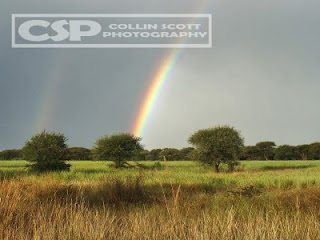
Recently I embarked on another couple of road trips. First was off to Mpumalanga region. Sabie, White River, Nelspruit through to Piet Retief and moolman before returning to Pretoria. Among the tall trees of Sabie, there are many roads such as this.
In between all the trees, roads and little of anything else, I spotted one of many old neglected houses...
They too had little roads leading into the forests. The guest lodge I stayed at had a pretty cool pool.
Just outside Nelspruit, the sky began to clear up. Taken amongst the hills and valleys of Mpumalanga. This Giraffe and Zebra were spotted along the side of the road, behind fencing of course on a game farm just outside Nelsruit. Up the hills and back into the contry side. Misty morning in Moolman, a tiny place not even spotted on a map, but 15 minutes from Piet Retief.
I then did Free State and Northern Cape regions. Quite different part of the world with much to see. For now I just posted some windmills spotted along the road.
Our land is as diverse as the people, if not more. You can travel 50kms and the colour of the earth itself will change constantly. This is typical Free State farm lands.
Nature's sculpturing is phenominal.

Artistic Editing 2

Ok, upon a request from a friend, I'm posting this up, slightly (well, very) delayed.
I took this photo some time back and on camera it looked good until I got home and loaded it onto my pc. Oh, the shock, the horror! The sky looked good but the foreground was so dark and hard to distinguish what was what.
First thing I did was use my image viewer, in this case ACDSee 9, to adjust the shadows and highlights. Once I'd done that I could see the potential and possibility of recovering the image and making something worthwhile of it...
So, I loaded it into Photoshop CS2 and began to play around. I soon realised that I would have to work the sky and foreground in separate layers to create a nice balance between the two. So, I first ran the shadow/highlights in CS2 this time, not using the ACDSee version. After that, I duplicated the image layer and then hid it (by clicking on the little eye) so I could tackle the foreground. First thing was to adjust colours (selective colour) and then adjust brightness/contrast before desaturating it a tad to tone down the colours. Once I was happy with all the work I'd done, I selected the layers including the original image and then, with right-click, merged all together into the layer so that I can get to work with the sky.
The sky needed a different amount level of processing. So, for this I ran selective colour to adjust the cyan, blue and white to the desired effect. Of course contrast/brightness was used very subtly before running levels and another round of selective colour. Once I was again satisfied with the end result, I again merged all the layers into the image layer.
Now I have two completely different looking images of the same picture posted above but layering over each other. Time to erase...
Using my erase tool I set about erasing the land from the top layer. I use a spray type brush for my eraser that erases all in the center of it's brush but fades to the sides allowing room for errors. As I got closer to the horizon, I had to reduce the size of the brush so as to not over erase into the sky. An alternative to this would be to use the magnetic select tool )but isn't as much fun for me) and then select and delete. So, once I had my sky trimmed properly, I made the bottom layer visible again allowing me to see the difference my processing work has made.
Well, many are happy with the end results.
Hope you enjoyed another interesting insight and tip. This will be followed with more soon.