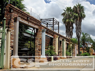
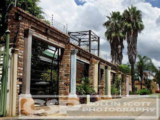
I use one image that I blend and alter in various layers.
Okay, so the original, like this one below, is actually “not bad” to start with. Good light, nice colour and detail but it’s just another photograph… yawn… I started out just adjusting the colour for richness and a little more vibrancy. As usual, I got carried away and started to add more and more layers.
 Woops! Now I have it looking somewhat flat! My bad… okay not really. This is deliberate, you’ll see why in a bit. I now duplicated the original image and adjusted the exposure up a tad to brighten things up again and give back some colour [opacity remains at 100%]. I set this layer to soft light as well for obvious reasons. Now it’s starting to look more like a nice image with pretty colour and detail, right? I then duplicated the original again, set it to soft light too with opacity of 12% and it made the slightest of difference but will come into play later as it merely tones the image by that 12% colour wise.
 Now, one of usual tricks is of course, the black & white layer (desaturation and brightness/contrast adjustments merged into layer). Soft light setting again and this time 35% opacity (yes, opacity will vary depending on how much shadow you wanting back). The problem with this layer is now the clouds become even brighter than before. No problem to my trusty eraser… be careful not to over erase though. Look! It’s really standing out now! How cool am I?

But, the sky, seriously, look at that sky!! Still too bright and clashing with the rest of the picture. New layer again and yes, you guessed it, set to soft light again (with opacity at 100). I used a heavy brush of black paint and got to painting all the light spots like the sky and all the pillars. You have to admit, it was needed, right? Okay, none of this is really needed, but I love doing it, so I will do it.
 Looking good? Almost… I’m still not happy with those bright clouds. So, another [soft light] layer is added and more heavy paint work is done. This time, just to the clouds because the pillars look good to me. This has now gotten the colours and detail of the clouds to match the rest of the image quite nicely I think.
 But, all this work comes at a price of course… in this case, it was light, the image is now a lot darker than when I started out on this project. So I played just a little more adjusting levels and then of course playing with the selective colour feature… as always… what can I say, I like to enhance the colours to give you this pretty little picture.
 So, ladies and gentlemen, another tidbit to add to your learning curve. Remember, shoot wisely, plan carefully and always, always have fun doing it.
 Oh, you can also drop me a mail on cdscott76@gmail.com if you’re keen on any prints or other queries you might have.


