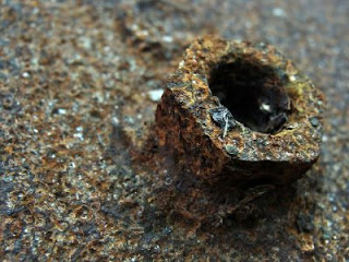
 Right, first things first, I cut out just what I wanted. Lost the grit and dirt on the image, cropped the blighter so that I had just what I wanted from the image. Then, once that was done, adjusted the colour tones, enhanced the lighting and shadows. Once all this was done... you get what you see below... something pleasing on the eye, ready to frame and hang on a wall.
  Camera settings of my Sony DSC-H10 on this one are: Exposure time (Shutter Speed): 0.0080 s (1/125) ~ ISO: 100 ~ Aperture: F3.5 ~ Focal length: 6.3mm with a manual Exposure. Unfortunately, some of the settings are still automatic and can't be changed, such as focus.
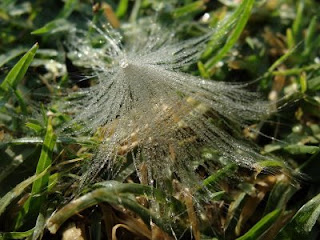
Now, this was intersting, I like catching the dew drops on things in the early hours of the morning. So, when I saw this I had to take a photo of it. Well, at a glance, it looks like typical garden nuisance, but to me, well... Time to edit...
 Same camera settings as the previous one...
---o0o---
Now, not all photos need to be of places, plants, people, or any other thing you'd usually see in magazines or the usual book... sometimes it's nice to spot the lesser noticed and get a nice abstract image that would look good in a gallery, or corporate building. like the one below...
 Note: Composition doesn't mean always having your subject in the center, 99% of the time the subject is off centre. This one made good use of "rule of thirds".


No comments:
Post a Comment