Nov 15, 2009

Landscapes From Recent Road Trips

Recently I embarked on another couple of road trips. First was off to Mpumalanga region. Sabie, White River, Nelspruit through to Piet Retief and moolman before returning to Pretoria. Among the tall trees of Sabie, there are many roads such as this.
In between all the trees, roads and little of anything else, I spotted one of many old neglected houses...
They too had little roads leading into the forests. The guest lodge I stayed at had a pretty cool pool.
Just outside Nelspruit, the sky began to clear up. Taken amongst the hills and valleys of Mpumalanga. This Giraffe and Zebra were spotted along the side of the road, behind fencing of course on a game farm just outside Nelsruit. Up the hills and back into the contry side. Misty morning in Moolman, a tiny place not even spotted on a map, but 15 minutes from Piet Retief.
I then did Free State and Northern Cape regions. Quite different part of the world with much to see. For now I just posted some windmills spotted along the road.
Our land is as diverse as the people, if not more. You can travel 50kms and the colour of the earth itself will change constantly. This is typical Free State farm lands.
Nature's sculpturing is phenominal.

Artistic Editing 2

Ok, upon a request from a friend, I'm posting this up, slightly (well, very) delayed.
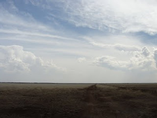
I took this photo some time back and on camera it looked good until I got home and loaded it onto my pc. Oh, the shock, the horror! The sky looked good but the foreground was so dark and hard to distinguish what was what.
First thing I did was use my image viewer, in this case ACDSee 9, to adjust the shadows and highlights. Once I'd done that I could see the potential and possibility of recovering the image and making something worthwhile of it...
So, I loaded it into Photoshop CS2 and began to play around. I soon realised that I would have to work the sky and foreground in separate layers to create a nice balance between the two. So, I first ran the shadow/highlights in CS2 this time, not using the ACDSee version. After that, I duplicated the image layer and then hid it (by clicking on the little eye) so I could tackle the foreground. First thing was to adjust colours (selective colour) and then adjust brightness/contrast before desaturating it a tad to tone down the colours. Once I was happy with all the work I'd done, I selected the layers including the original image and then, with right-click, merged all together into the layer so that I can get to work with the sky.
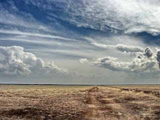
The sky needed a different amount level of processing. So, for this I ran selective colour to adjust the cyan, blue and white to the desired effect. Of course contrast/brightness was used very subtly before running levels and another round of selective colour. Once I was again satisfied with the end result, I again merged all the layers into the image layer.
Now I have two completely different looking images of the same picture posted above but layering over each other. Time to erase...
Using my erase tool I set about erasing the land from the top layer. I use a spray type brush for my eraser that erases all in the center of it's brush but fades to the sides allowing room for errors. As I got closer to the horizon, I had to reduce the size of the brush so as to not over erase into the sky. An alternative to this would be to use the magnetic select tool )but isn't as much fun for me) and then select and delete. So, once I had my sky trimmed properly, I made the bottom layer visible again allowing me to see the difference my processing work has made.
Well, many are happy with the end results.
Hope you enjoyed another interesting insight and tip. This will be followed with more soon.

Oct 19, 2009

Artistic Editing 1

Okay, so you have a nice photo taken. But, it's just a photo and you want to wow viewers with a different look, right? Sure you do... I mean, why have normal photos that do look nice if you can add a little something to make them so much more.
So, below is a couple of examples of 'how to' make your images a little more striking when printed and framed.
This first crop of a Rose and buds is nice, great background, detail and so on. But, the colour is a little "flat" and the image isn't nearly as striking as can be. Time for it to go into Photoshop.
Okay, I duplicated the same layer twice over the original. Then I started on the original layer with some shadow/highlights (Image, Adjustments, shadow/highlight) and selective colour (Image, Adjustments, Selective Colour) to lift the colours and lighting a bit to make it stand out more.
Then, on the second layer, I used the Dream Suite plug-in to add a ghost blur effect. Then, on this layer I used my erase tool, set to about 250 and opacity of around 25, to gradually start erasing from the centre of the Rose bud so as to fade it towards the edges. I did this to keep the detail sharp in the centre of the rose but blur it out to the edges to create a dreamy look and feel. It did take a couple of attempts, but got the dream feel I was after. So, now it started to look good... but that was not enough to complete this Rose image, it was lacking something... oh yes, the third layer. I de-saturated (Image, Adjustments, Saturation) this layer (removed all the colour to black and white) and then added a strong contrast (Image, Adjustments, Brightness/Contrast) to darken the blacks more. So now I have a black and white layer over my other work. Again, the erase tool was called upon. This time with the opacity at just under 20 (can't remember exactly) and size of 600, I started to erase from the centre. With each click, I would widen my circumference until I had created a vignette look to mostly the corners of my image enhancing the focal area.
Final result below.
---o0o---
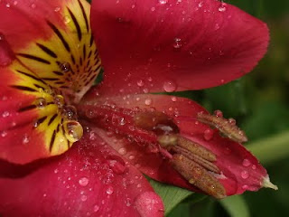
Here is another example of a similar processing style. The only difference is that instead of the vignette looking corners, I opted for a Diffused Glow blur (which basically enhances light spots and gives them their own unique hint of blur) which I then gave an opacity of 65 so it would blend more with the original image. Note: This Inca Lilly has had NO colour enhancement, shadow/highlight work or anything, except for cropping it for composition purposes.
Before ->
After ->
And so ends part one.
---o0o---

Sep 26, 2009

Back to Task

Okay, I lost track and was just posting pics without explaining much. I said I would post as I learn new tips n tricks. Well here's a kicker for you all.
This is the original image, slightly over exposed so colour detail is lost somewhat. Time to take it into PhotoShop.
First thing I did was to twiddle the shadow/highlights a bit to lighten shadows and darken the background a tad (under Image, Adjustments - Shadow/Highlights). Once that was sorted it was time to adjust colours with selective colour, shift the brighness/contrast to boost colour a tad more and give it very subtle saturation. Once I had colour, brightness, saturation and all that done, it was time to add to the point of focus. So, I added a blank layer and filled it with a gradient fill using the gradient tool. Set it to wide radial to darken the rim of the image and draw one's eye to the centre of focus, then made the opacity 30% so it doesn't overpower the focal point.
Then I got carried away...
I added another layer duplicating the image, added a gaussian blur of 8.6 and using my eraser, with a 300 pixel brush size set to 40% opacity, started to erase from my centre of focus outwards. Once I'd done that I got to thinking of adding yet another layer. This time I duplicated the original adjusted image and converted it to a high contrast black and white (shifting saturation all the way to the left then adding brightness/contrast and merging these into the layer) which I then also erased wider than the blurred layer. So now I have four (4) layers in total and the image is really starting to take shape. One final thing, I thought to myself, was to add a border frame for canvas print... so I went to work again. I selected a rectangle (using the rectangle select tool) and drew a rectangle, as even as possible, and then inversed my selection (Alt-S ~ inverse) to have only the border selected. I then added more Gaussian blur and with 30% opacity painted white over it. After that I boosted the exposure (Alt-I [Image]; Adjustments - Exposure) by roughly +1 to brighten the border which will then be folded over the canvas edge. The final result below...
And so ends a brief tutorial on making an image more attractive. Now go out and take pictures keeping this in mind.

Aug 10, 2009

Road Trips, South Africa ~ Part One

Right, in no particular order, some of the photos from my recent travels around the drier areas of Southern Africa. We have such a beautiful and diverse land. Please bear with me as some (well, most) of these were taken from a moving vehicle. On one side, when you travel deep Free State and Northern Cape, it's pretty much flat. Then you head more eastern side towards White River and Sabie stopping by places between, it's hilly, green and lush.
 
---o0o---

Morning trip, just before passing Witbank heading towards Nelspruit and White River...

 
Just some of the country side between Nelspruit and White River.
 
 
In the middle of nowhere... civilization exists, spotted this shopping center about an hour's drive from Douglas, but about an hour plus before Kimberly.
 
 
Crossing a single lane bridge about 20 minutes from the industrial farm town of Jan KempDorp.
 
A run down shoplet in Jan KempDorp.
 
Kimberly behind us, Jan KempDorp ahead, somehwere on this road.
 
 
Just one of Kimberly's attractions, spotted as you enter the town.
 
 
Between Bloemfontein and Kimberly, the road is flat... and straight... a road where lots of this can be seen...


Approaching Bloemfontein in the early morning mist.

Sunrise between Johannesburg and Bloemfontein... somewhere...


I am developing a greater love for my contry, South Africa. Such a diverse land, culturally and by design. South Africa, a land of many splendors I have yet to see and experience.